UI/UX
HEAVN App
Tools
UX Research: Surveys, Usability Tests recorded with iPhone, Adobe XD
UX Analysis: Miro Board
UI/UX Design: Adobe XD, Adobe Photoshop, Adobe InDesign
UX Research: Surveys, Usability Tests recorded with iPhone, Adobe XD
UX Analysis: Miro Board
UI/UX Design: Adobe XD, Adobe Photoshop, Adobe InDesign


HEAVN
Introduction to the HEAVN App
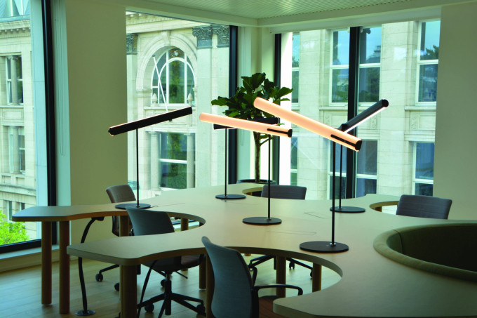
My assignment was to redesign and restructure an existing application. HEAVN App is a smart light App that works with a physical product. The product is a user-centric lighting that imitates the sunlight based on users current location, and offers different scenes to set up. I had the tasks to do the onboarding screens, making the app look “cooler”, making the main screen more clear and conducting UX/UI changes in general. While doing this project I have gained hands-on experiences in many UX methodologies in collabration with a multi-disciplinary team.
The Assignment
Defining the Challenge
What is my Assignment? Really!
As I was introduced to HEAVN Light, my initial thoughts were “wow, such a fancy smart light!”. There is a physical product and an application to connect the product with. After trying out the application for a few minutes, I started asking the following questions:
- Who is using the application
- What does user want to do
- The user’s main goal
- What else can user do
- The steps the user takes to accomplish a particular task
- Are the buttons on the physical product same ones as on the application
- What is that distinctively big circle in the middle of the screen, is it coherent with main use case of the product
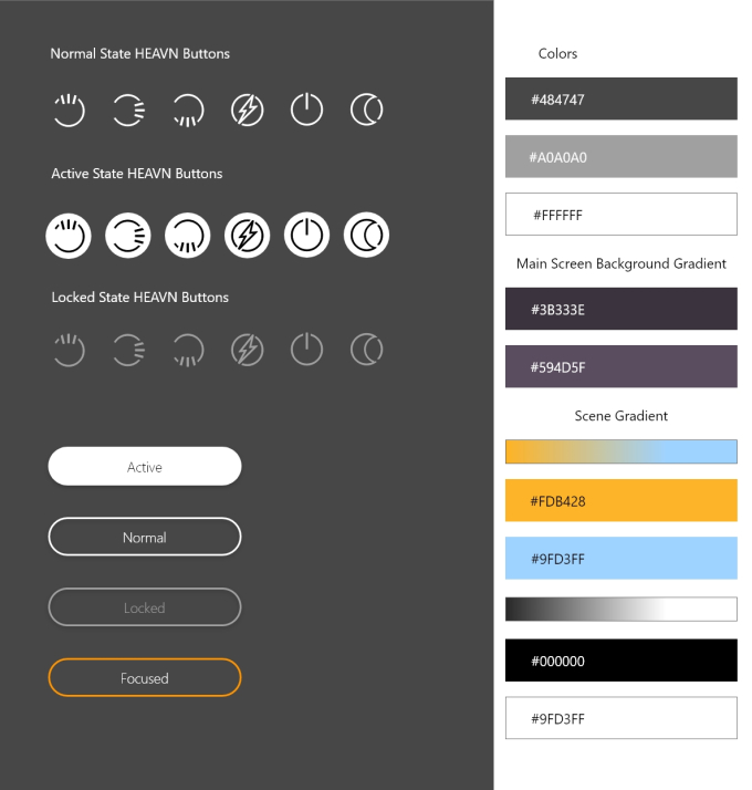
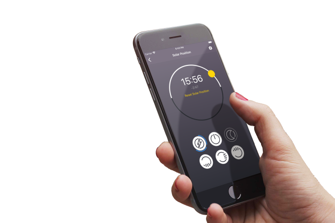
Main idea of HEAVN App is to imitate sunlight by using real time solar positioning. The application gets the information for solar positioning through users current timezone. This product helps users have natural sunlight in their homes when the sun is hiding behind the clouds or when they live in rooms with small windows and do not get enough sunlight during the day.
Secondary use-cases of the application are mostly about adjusting the light brightness and color-scope, similar to many other smart light applications;
boost & relax modes, scenes, adjusting brightness and changing the sun positioning (the sun-wheel)
Methodologies
1 Research
– Competitor Benchmarking
– Online Survey
– Guerilla Testing
– Survey – Current Users
1.1 Competitor Benchmarking
Almost simultaneously I started my research on other apps in the market. This method was necessary to understand other competitors on the market and to analyse how their apps are designed. Note: There aren’t many “sun imitators” in market.
View Competitor Benchmark Results
1.2 Online Survey
I conducted online survey to a small target group to understand the coalition between user needs & struggles and to see what our product can offer as a solution
1.3 Guerilla Testing
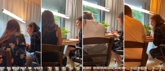
Conducting usability tests after the release of the product can be a tricky situation. My first “biased” opinion on the main screen were that the affordances were unclear and the settings were overloaded with too many choices. I needed some qualitative results and decided to conduct guerilla testing by giving several tasks to figure out the users mental models, as well as their attitudinal patterns and their feelings.
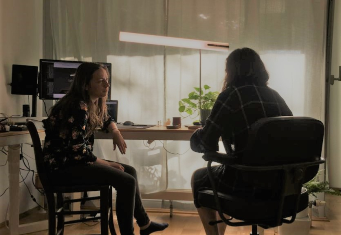
View Guerilla Testing Note Taking
1.4 Survey – Current Users
With the data we have gathered through surveys, usability tests and competitor benchmarking, it was time to talk to current users to validate our findings. My main concern was to find out the right way of approaching to the sun-wheel experience, and to prevent confusions. To find out in which frequency the users were turning the sunwheel and to have further insights on various user behaviours, we decided to conduct surveys on users who already own the product and the HEAVN App. All together with the stakeholders and team-members we prepared some questions during a meeting to implement the survey into the application. We perfected the questions during the follow-up meetings before releasing.
After Survey answers, talking with users in person and watching their feedback to the sunwheel in the store, it was decided that the sunwheel is a very important feature and we should apply Hick’s Law to reduce confusion on the main screen; our main concern is that the sunwheel is on the main-suncycle screen, everything else is secondary!
2 Analysis
– Case 1: Affinity Diagram
– Case 2 for Sun-Wheel Clarification: Personas and Empathy Mapping
2.1 Affinity Diagram
The raw data we had from guerilla testing and user-feedbacks needed more clarification. Me and a co-worker worked on the affinity diagram to finally make sense of all the research findings.

With the raw data of user-feedbacks, guerilla testing, competitor benchmarking and affinity diagram analysis, I proceed to highlight the common painpoints of the users.
01 Unclear functionality and false affordances
80% of the participants didn’t find the brightness option and confused it with the scene creating option.
60% of the participants thought the sun-wheel was for brightness adjustment at first sight.
02 Settings is overloaded and confusing
Information fatigue in the settings. Users felt overwhelmed by many options. They were also more likely to fail their tasks when I didn’t verbally explain them the difference between “Manual Control” and “Maximum Brightness”
03 Video-Call option overrides the main screen, but this is unclear for users
60% of the participants got stuck on the “video-call” scene, did not understand that scenes functionality overrides the ability to adjust the sunlight, creates frustration
04 Buttons needs to be more explanatory
All users had to try out every button to understand their individual functions.
Pain points clarification on screens
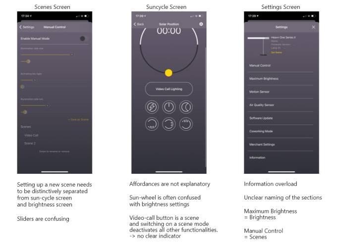
There are many features in settings, which are hardly in the 50 percent according to Standish’s research. Standish’s research and more recent estimates shows, that 20 percent of the software features are often used, while 50 percent are hardly ever or never used. I came to the conclusion that these features are not within the scope of my main task.
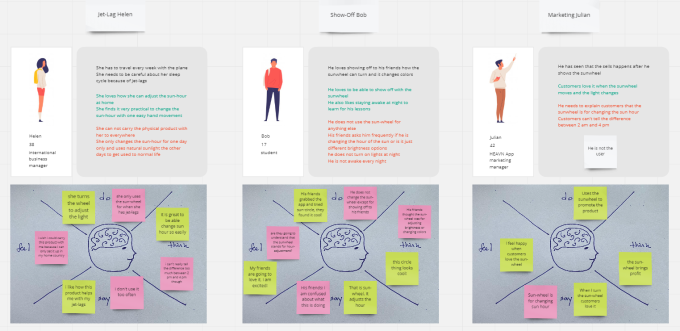
2.2 Personas and Empathy Mapping for Sun-Wheel Clarification
As a secondary task, I dived deeper into the possible use-cases of sun-wheel by creating personas based on our feedback database of people who have the physical product and are most likely to use it. User profile are mostly 50+ year old people with above-average income.
3 Design
– Mid-Fidelity Wireframes
– High-Fidelity Wireframes

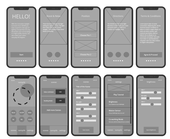
3.1 Mid Fidelity Wireframes
After all the research and analysis, it was time to proceed with wireframes. My goals while designing the screens were:
– Affordances clarity on the suncycle screen
– Easy-to-use navigation bar according to Fitt’s Law with users wishes, preferences and pain points in mind
– Scenes screen on navigation bar
– Sharing location and time-zone informations on main screen
– Re-thinking manuel sunwheel, making it not interactive to avoid confusions with brightness settings
– Placing interactive sunwheel in settings
– Friendlier UI
– Explanations inside the interactive fields, under names
3.2 High-Fidelity Wireframes
After positive feedbacks from my co-workers I proceed with high-fidelity wireframes.
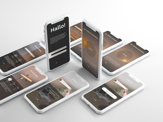
3.2.1. Onboardings
It has been decided that doing onboardings are top priority after looking into user data. HEAVN App is mostly only used on the first 3 days of buying it and only 20% of the users keeps using it after 4. day of purchase. Overall screen times was also 30 mins; users were having trouble understanding affordances or having trouble navigating throughout the app. Our goal was to decrease screen time to 15 mins and help users set up the product faster and easier. During the making of onboarding screens, we have come to two conclusions.
01 Seperate screen for dynamic scenes
We have validated our need for a seperate scenes screen. We don’t have the scenes settings on onboardings yet – the discussions for the possible scenes are still ongoing. Feedbacks from users and surveys will conclude which scenes we will apply to the product. Another topic is if the scenes should be static or dynamic. For the time being I proceed with dynamic scenes, that can be adjusted and alligned with the suncycle functionality, since that is the wish of the Stakeholders.
02 Light directions clarity
The physical product has 3 different lights installed and each of them looks to a different direction; upwards, downwards and one middle light. The physical product can be turned 180 degrees, causing confusion for the users. Adding an option to adjust the product positioning on onboarding help clarify the affordances on the main screen. This also led to designing a product positioning screen embedded in the application.
3.2.2. Sun-cycle, Scenes and Settings Seperation
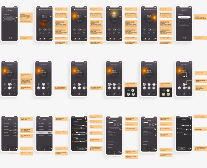
01 Redesigning Sun-Wheel for Clarification
02 Removing “Video-Call” from Solar Positioning Screen
03 New Scenes
04 Clear Navigation Bar
05 Product Positioning adjustment
06 Redesigning UI Elements
4 Result
With the new screens conversion rates increased by 7% in one month. Customer happiness in HEAVN Store has increased, which led to selling more products. Overall screen time dropped from 30 mins to 15-20 mins. Customer service of HEAVN also mentioned they are not getting calls to clarify the affordances anymore.
4.1. Prototype
I am still working on the App and the final results are not final yet.

