UI/UX Design
FlyUX
Tools
UX Research: Google Surveys, OBS Studio, Adobe InDesign
UX Analysis: Miro Board, Lucid App
UI/UX Design: Miro Board, Balsamiq Wireframes, Adobe XD, Adobe Photoshop, Adobe InDesign
FLYUX
Introduction to the Flight App
I had the assignment to design a fictional flight app called FlyUX during my studies in UX Design Institute backed by Glasgow Caledonian University. While doing the project I gained a better understanding and hands-on experience in design principles, patterns and many other UX methodologies.
Methodologies
1 Research
– Competitor Benchmarks
– Online Survey
– Usability Tests
– Note Taking
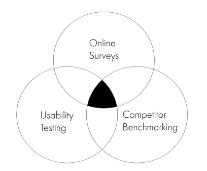
Research is the first step in the problem solving process. To collect credibly and validity in research findings, I followed triangulation technique.
1.1 Online Survey
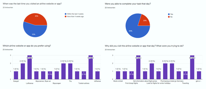
I started my research by conducting surveys to people, by sending the survey to several social network groups and communities asking for a small favor.
1.2 Usability Tests
Usability Testing is critical for collecting more quantitative data. I conducted usability tests with Ryan Air and Lufthansa.
*Due to privacy reasons I did not showcase the recordings

2 Analysis
– Affinity Diagram
– Customer Journey Map
2.1 Affinity Diagram
KJ’s method is a grouping process for establishing priorities. There were lots of unorganised raw data collected from the research phase, now it was time to give a structure to all of the findings with an Affinity Diagram. I worked in collabration with a friend through Miro Tool. We started with analysing survey results and watching the usability tests together while taking notes individually. Finally we did brainstorming on how to categorise our findings accordinly.

2.2 Customer Journey Map
A great tool for clarifying affinity diagram is customer journey mapping. I focused on analysing what users did, how they felt and what did they expect on every step of the booking process to have insights on their pain points.
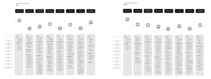
After conducting user interviews, collecting insights from users’ interactions and doing affinity mapping I have underlined these common pain points:
01 Navigation is unclear
Users were unable to tell how much longer they must to go through all the unnecessary ticket extras.
02 Unexpected Total Price
Booking extras are hard to find and have no clear information of how they affect the total price, users felt deceived.
03 Missing Progress Indicator
Most of the frustration came from not seeing an updated overview of the ticket and the total price.
3 Design
– User Flow
– Low-Mid and High-Fidelity Wireframes
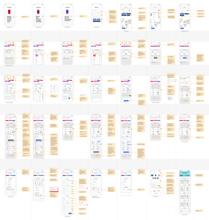
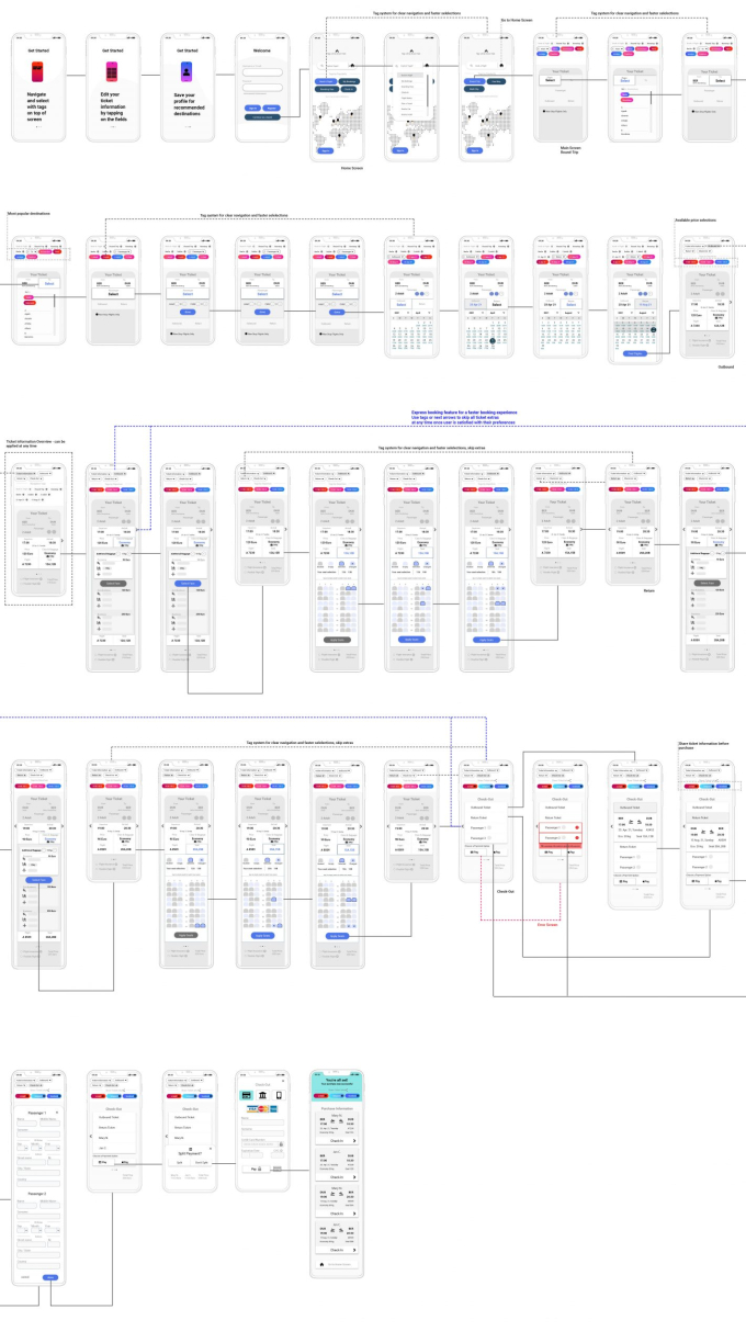
3.1 User Flow
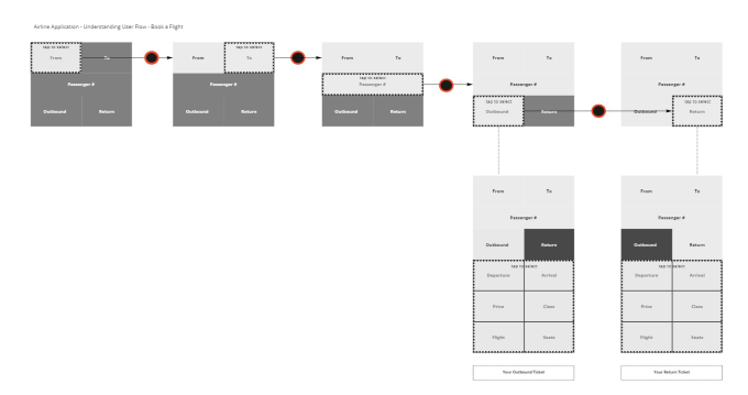
My next steps were to start creating the journey of the user throughout the booking process. After some rough sketches I created my first high-level user flow.
It was bugging me how I actually could find a better solution that covers all of the painpoints at once.
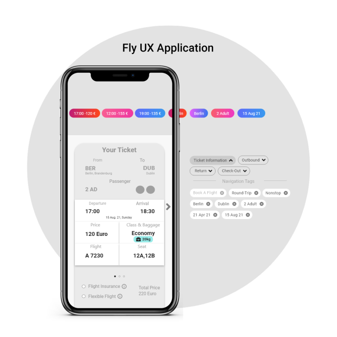
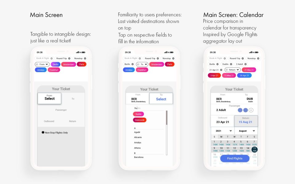
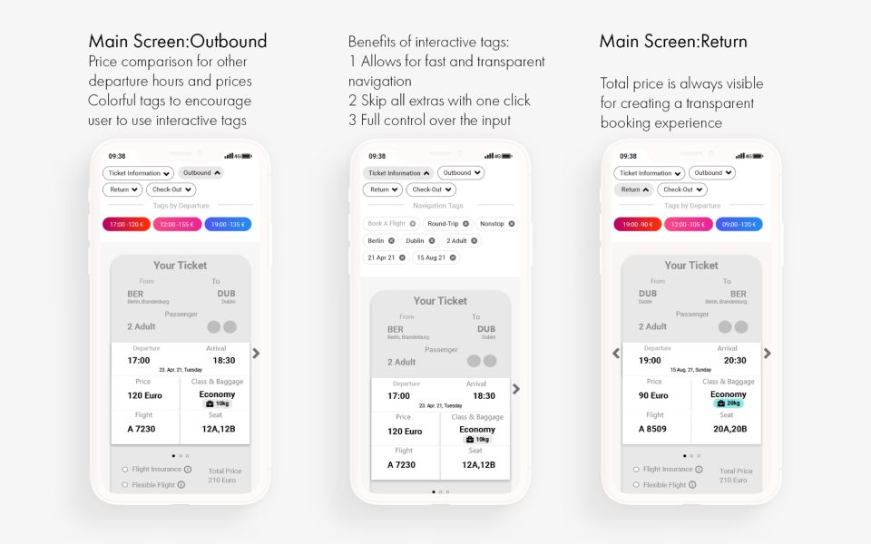
I decided to do a user flow from scratch, turning tangible design to intangible, all of the information would be available on the screens, just like the printed-out tickets.


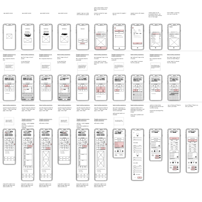
3.2 Low- and Mid Fidelity Wireframes
I started sketching low-fidelity wireframes to ask friends from various backgrounds about my idea. After several feedbacks, combined with all the research and analysis I did, finally I had a solid idea of what I was doing. I covered the three important pain points, making it a highly user-centric application.
3.3 High Fidelity Wireframes
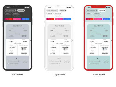
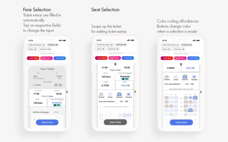
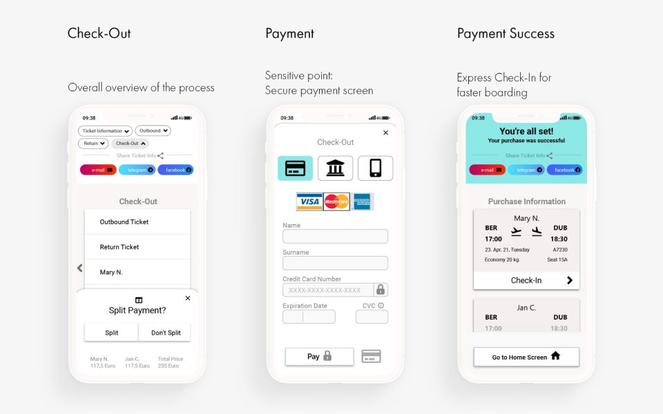
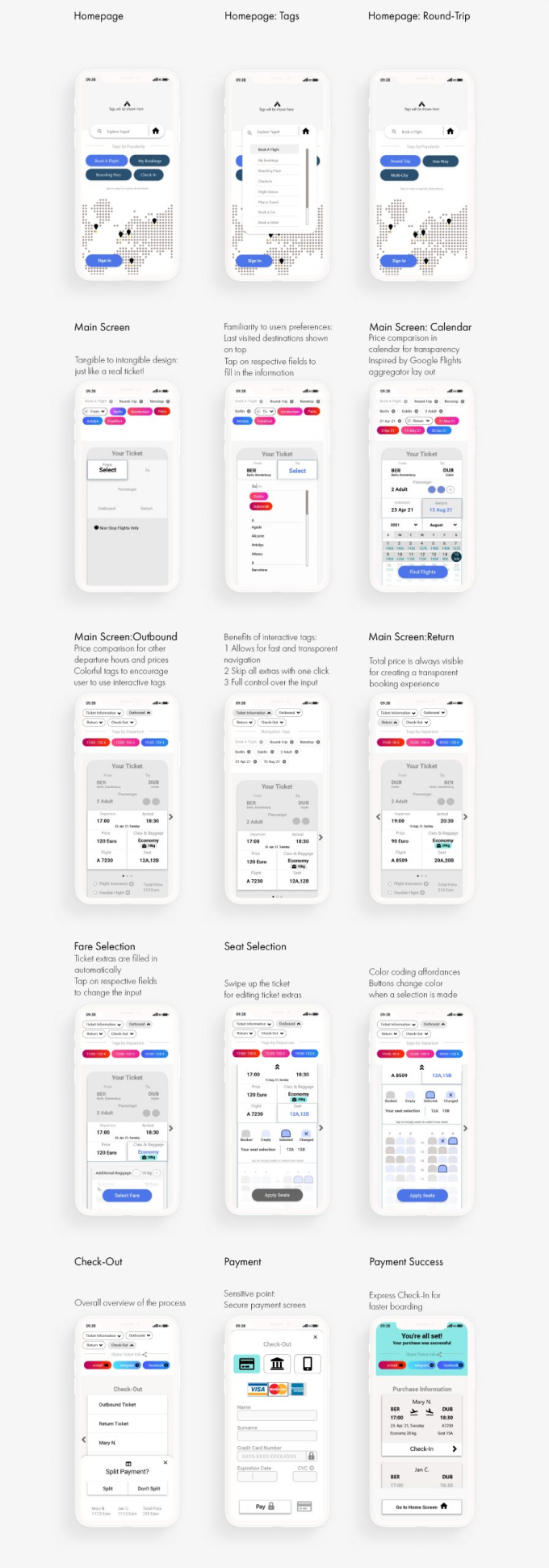
Before transfering the screens to adobe xd to start high fidelity wireframing, I had to find a solution to one last problem; I noticed that the screens could easily be overloaded with too many information. To prevent causing any information fatigue for the user, I used color-coding to highlight the respective fields that were editable. While doing so, I continuesly asked for feedbacks from my friends to ensure that my navigation and ticket system were easy to use.
4 Result
– Prototype
– UI Kit
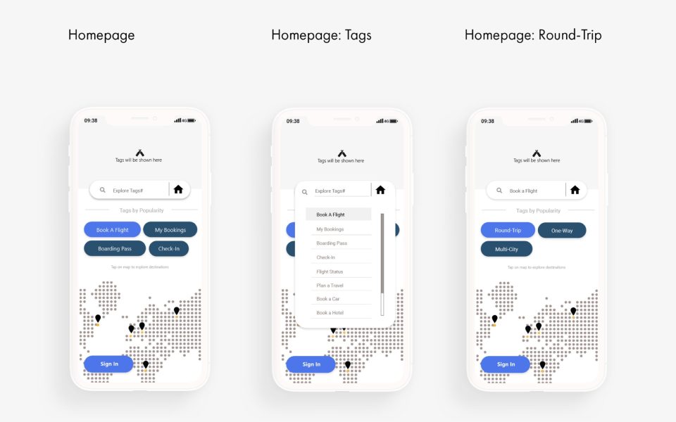
4.1 Prototype

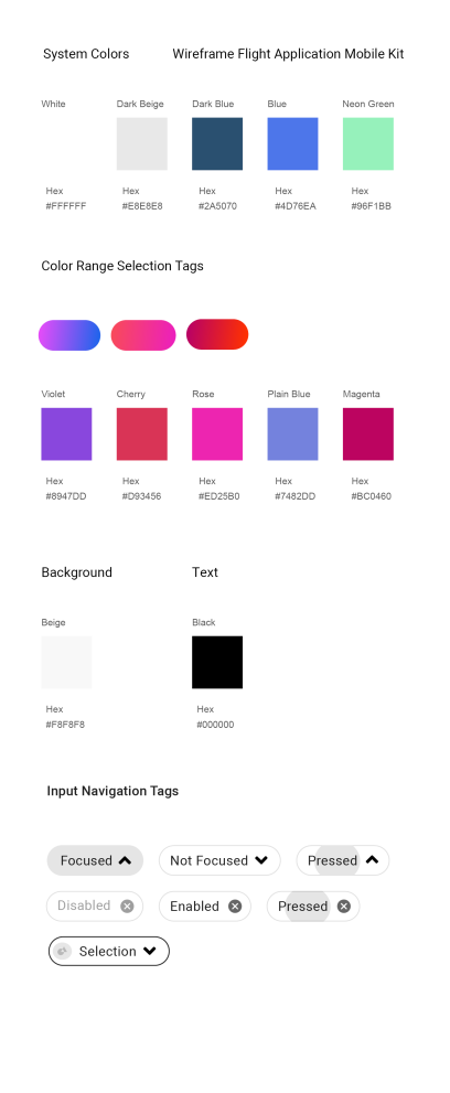
4.2 UI Kit
